After a series of debates within APU,
the APU Logo Working Group came to a decision
on the 10th anniversary commemorative logo
after exchanging opinions with public relations firm ASATSU-DK INC. and
designer Mr. YAMADA from TSU-KU-RU Inc.
We are happy to introduce the logo to our readers in this issue.
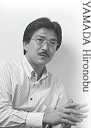
We asked our dedicated designer,
Mr. YAMADA about the message he hopes to convey with the new logo:
Impressions of the APU Campus
 The most surprising thing was the gleam in the students' eyes; it was markedly different from the students I am used to seeing in the big city. Students live and study amidst the natural beauty of Oita, and they are very aware of issues. I felt that APU students were full of life. The most surprising thing was the gleam in the students' eyes; it was markedly different from the students I am used to seeing in the big city. Students live and study amidst the natural beauty of Oita, and they are very aware of issues. I felt that APU students were full of life.
The Concept
"Find your future path at APU."
For students, APU serves as a kind of compass that guides them into the future.
APU proudly sends out a multitude of internationally-minded students every year, and their future potential is limitless. In the sense that students will continue to venture overseas without losing their way, I chose a symbolized compass for the logo design.
What message did you want to convey?
What were the challenges?
What I constantly kept in mind when designing this go was the image of students who will someday enter the real world. Because APU possesses uniquely attractive features that you cannot find anywhere else, I found it hard to think about what the logo should convey, but when everyone's passionate views came together into one distinct form, the difficulties were soon forgotten. In that sense, I can safely say there were no challenges.
The new logo will be used on posters, T shirts and commemorative goods. Keep an eye out for it!
|